Memory Printed and Placed

Principal
Guilherme & Gustavo Carvalho
Location
São Paulo, Brazil
Category
Arts & Culture

001 — Brand Positioning

Elegance / Quality / Storytelling

The heart of Oakhouse is memory. We helped Gui and Gus articulate their brand’s deeper purpose: transforming travel into art, and art into something personal. With every print, Oakhouse invites you to relive places you’ve loved or imagine the ones you’ve yet to see. We refined their market focus, developed a competitive narrative, and implemented a content strategy that feels as curated as their gallery, making each purchase a story, framed.

002 — Visual Identity

Fig. 1 Digital asset
Fig. 2 Responsive logo
Fig. 3 Logo sketch

The original identity lacked consistency. The original look was improvised, assembled out of instinct. It had charm, but no spine. We kept what mattered: the restraint, the quietness. Then we added structure. Deep green met soft grey, while white was used generously. A slender serif led each headline, while the body took shape in a rounded sans. It became easier to read. Easier to trust. Better understood.

003 — Wild Card

Fig. 1 Homepage detail
Fig. 2, 4, 6 Brand mockups
Fig. 3 Product card
Fig. 5 Hotspot section

Rather than expand with noise, we chose fewer elements, used more deliberately. We designed brand documentation and website assets—each one treated with the same calm attention as the brand itself. Nothing ornamental. Nothing rushed. The goal was not to impress, but to feel familiar, and create the kind of brand you don’t notice right away, but end up remembering.

004 — Digital Rebrand

Fig. 1 Homepage
Fig. 2 Cart
Fig. 3 Shop the Look

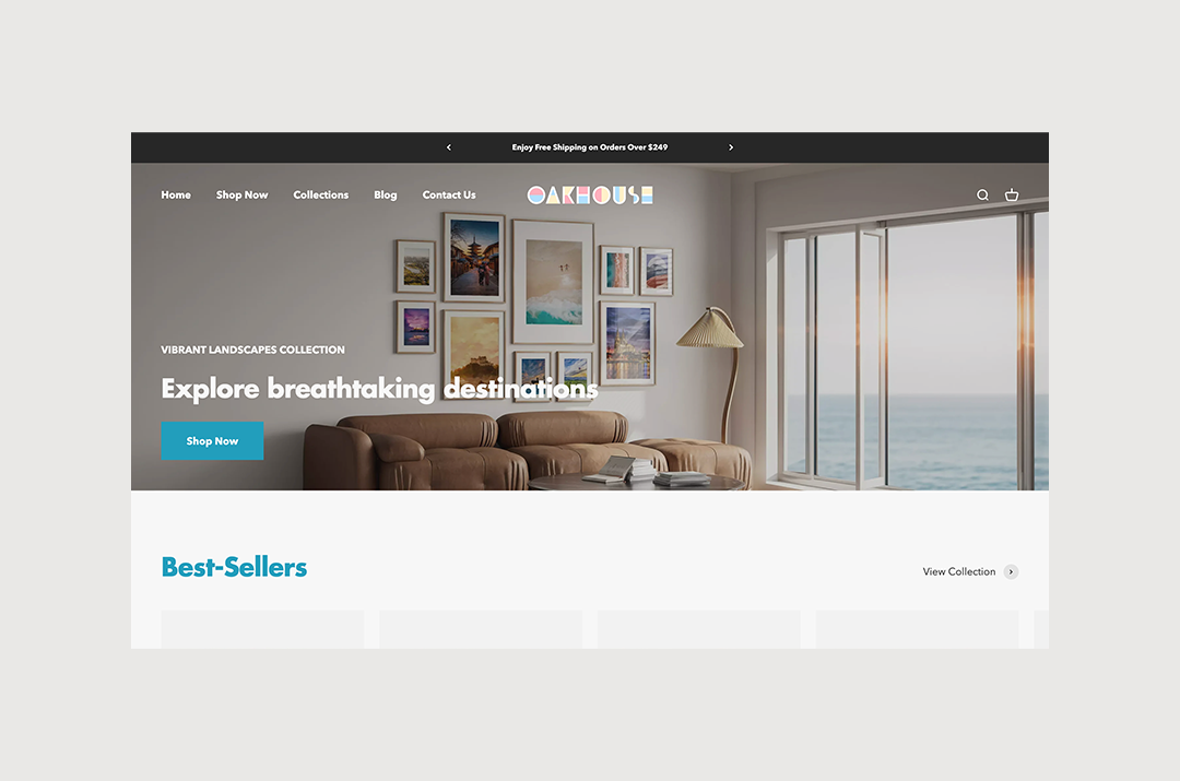
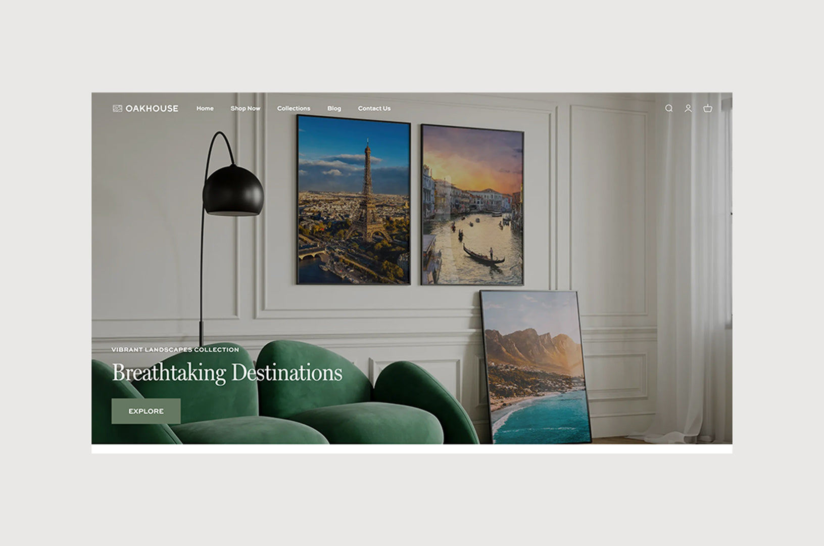
They had a Shopify store. It worked, but felt disconnected from the world they were trying to show. So we rebuilt it. Frames now blend into the background, making each product card feel like a print already on the wall. A new section lets people preview artwork in a room, not just on a screen. Navigation became simpler. Their confidence grew. Sales followed.

Before

After

Creative Direction Nina de Paula
Visual Identity Nina de Paula
Shopify Development Nina de Paula
Junior Designer
Rachel Scolnik
Photography Oakhouse

"Firstly, we want to express our deep gratitude and admiration for the work done in implementing our brand on Shopify and developing the definitive brand manual. We are absolutely delighted with the results! The switch to Miller font and other design choices not only met but exceeded our expectations, giving our brand a cohesive visual identity aligned with our values. The application on the website was flawless."
— Stephen Hochman