From Hardware to Selfcare

Principal
Jerome Ling
Location
Kuala Lumpur, MY
Category
Consumer Brands

001 — Brand Positioning

Fresh / Minimal / Feminine

When Jerome first launched Homi, he imagined a neutral lifestyle brand. But clarity came with time. Women were not just part of his audience, they were the audience. We helped him reposition Homi as a soft, confident brand that prioritises care. The message is no longer generic wellness. It is clear, intentional and feminine in a subtle way.

002 — Visual Identity

Fig. 1 Shower Bundle
Fig. 2 Shower Packaging
Fig. 3 Brand Guidelines

Homi’s new identity is fresh and quiet. We kept things clean and weightless, building around a soft palette of pale blue, white and a hint of yellow. Typography is bold but never loud. Everything evokes clarity. The new look mimics the feeling of stepping out of a cool shower, skin damp and air still. With gentle femininity and absolute intentionality, Homi now owns the aesthetic of purity without shouting for attention.

003 — Wild Card

Fig. 1 User-Generated Content
Figs. 2, 4, 6 Product Packaging
Figs. 3, 5 Brand Imagery Assets

The transformation extended beyond the logo. Homi’s new packaging speaks to the idea of cleanliness as a lifestyle. Refills, filters and even shipping boxes were redesigned in light, greyish blue with minimal language and generous white space. We created a blocked grid system where all the information goes. The effect is immediate. His brand moved from budget utility to understated luxury. Homi now feels closer to selfcare than hardware. A brand that sells clarity, inside and out, through every touchpoint.

004 — Digital Rebrand

Fig. 1 Homepage (desktop view)
Fig. 2 Homepage (mobile view)
Fig. 3 Product Page

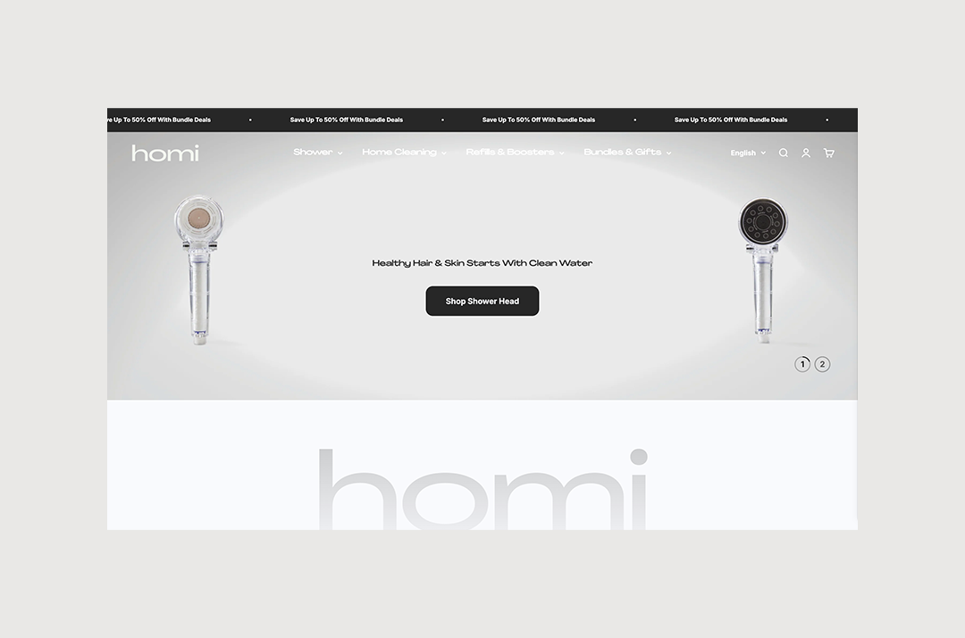
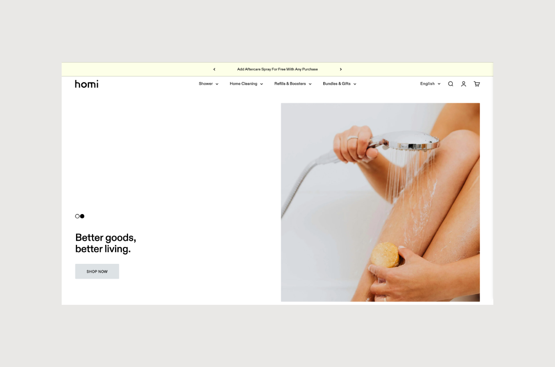
Jerome’s website needed a little more than alignment. It needed vision. We re-skinned his Shopify store to reflect the new brand without rebuilding from scratch. Sales pages were redesigned to live natively on Shopify, removing the need for external tools and saving on costs. Some products now have a long-form page that informs and converts. The experience is softer, deeper, more cohesive. What was once fragmented now feels whole.

Before

After

Creative Direction Nina de Paula
Visual Identity Nina de Paula
Shopify Development Nina de Paula
Copywriter Yusra Elahi
Photography Homi

"Nina is wonderful to work with, she delivers on time, and her work is creative and unique. She listens to feedback well and does everything she can to help with the project. I highly recommend working with her."
— Jerome Ling